Our favourite 6 web design trends for 2015
Here’s our list of 2015’s amazing web trends, showcasing the new evolution of web design & development.
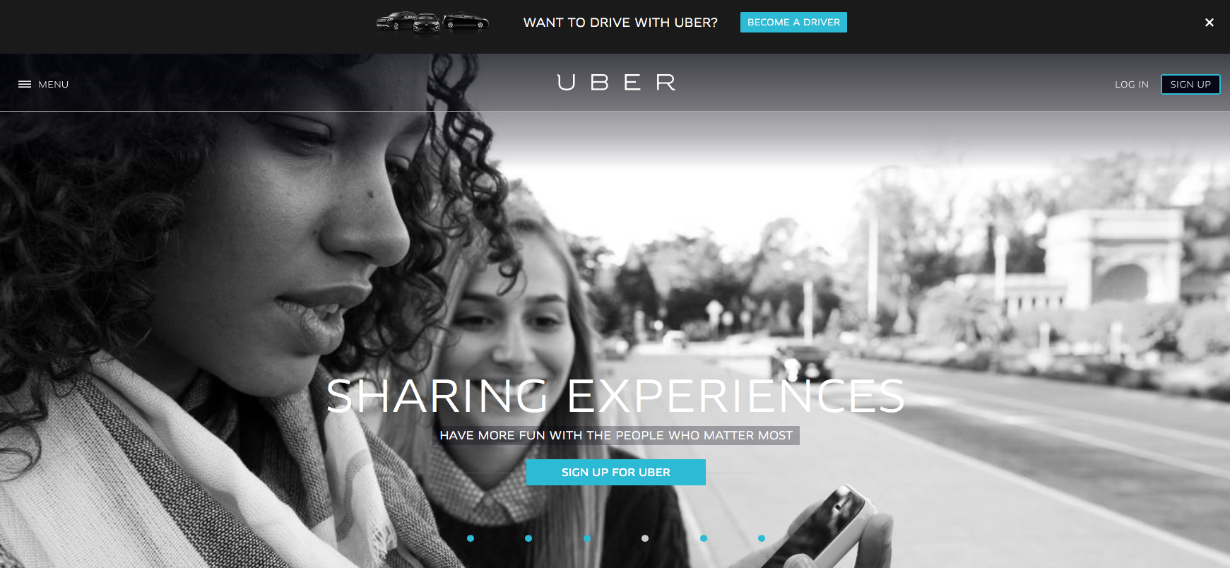
Bigger text & Bigger image driven websites
With the increased usage of Retina & HD screens. it’s now essential for designers to serve large copy-driven text and high-resolution images that will resize and optimise for both server and screen sizes.
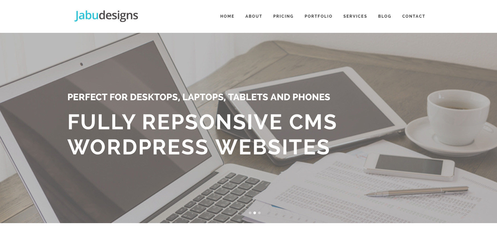
Long Scrolling / Parallax.
One big web design trend continuing on from 2014 is parallax scrolling, which involves the background moving at a slower rate to the foreground, creating a 3D effect as you scroll down the page.
Long Scrolling (or Parallax) webpages are far more user friendly because they are quicker than clicking, they are very aesthetically pleasing and almost intuitive as the mobile device user doesn’t have to think about what they are doing.
It’s a much smoother way to view a site and can be easier for users to navigate, especially if they’re viewing your site on a smartphone.
It helps convey masses of information without slowing down the experience for the user.
It’s time to start scrolling!
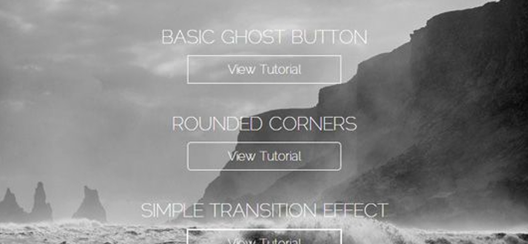
Ghost Buttons
Ghost buttons are a minimal and stylish way to add a touch of elegance to a website. They are designed to grab the users attention in a subtle way.
They are transparent but have a recognisable shape, are bordered with a very thin line and contain light sans-serif fonts. They also have a smart hover animation and pair well with large background images and videos (another trend that is on the up).
Ghost buttons are perfect for designers not wishing to clutter their sites with albeit necessary navigation, so prepare to see more ghost buttons than ever this year!
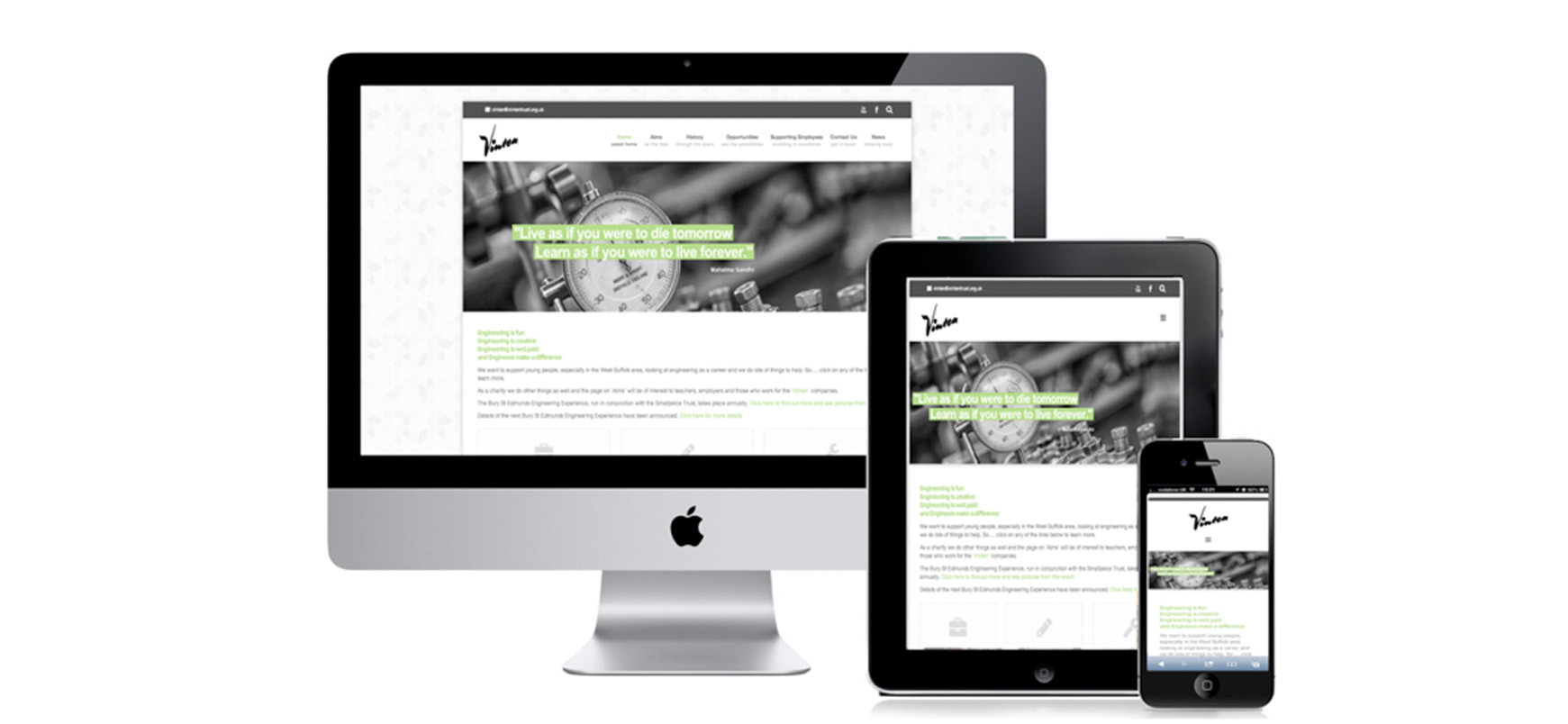
Responsive design… is evolving…
One trend we hope to see more of is mobile optimisation with a better understanding of user needs and performances.
Unlike isolated mobile websites, responsive web design adapts the layout to the viewing environment.
This presents an optimal experience for all users regardless of weather they’re using a phone, tablet, computer, or other devices.
According to the Office for National Statistics ‘during 2014, 36 million UK adults accessed the internet every day, and access to the internet using a mobile phone more than doubled between 2010 and 2013’ this is mainly due to the amount of people that are using their phones to go online, a trend that is only going to rise.
How can your visitors respond to you if your website does not respond to them?
Flat design
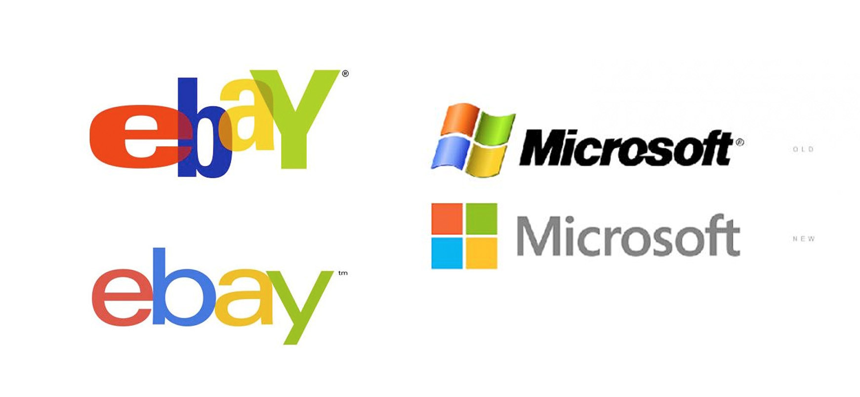
In case you haven’t heard of it, flat design is simple and elegant with clean lines and elements that appear smooth and minimalistic on screen, with the use of vibrant colours to help bring life to the website.
Flat design has been around for a while now but like background images and videos, its popularity in website designs is steadily increasing.
Flat design commonly uses contrasting texts and graphics, with vibrant colours whilst any 3D style effects (such as drop shadows or textures) are removed. This in turns removes any ‘visual clutter’ that may be distracting your users.
Advantages of this trend include easy to use interfaces, quick loading times for the user and the accessibility of the interface on various different sized devices. As responsive web design is becoming increasingly popular, flat design is favoured by many as it uses clear grid systems which are easily scalable.
eBay and Microsoft are two great examples of businesses that have opted for a flat design.
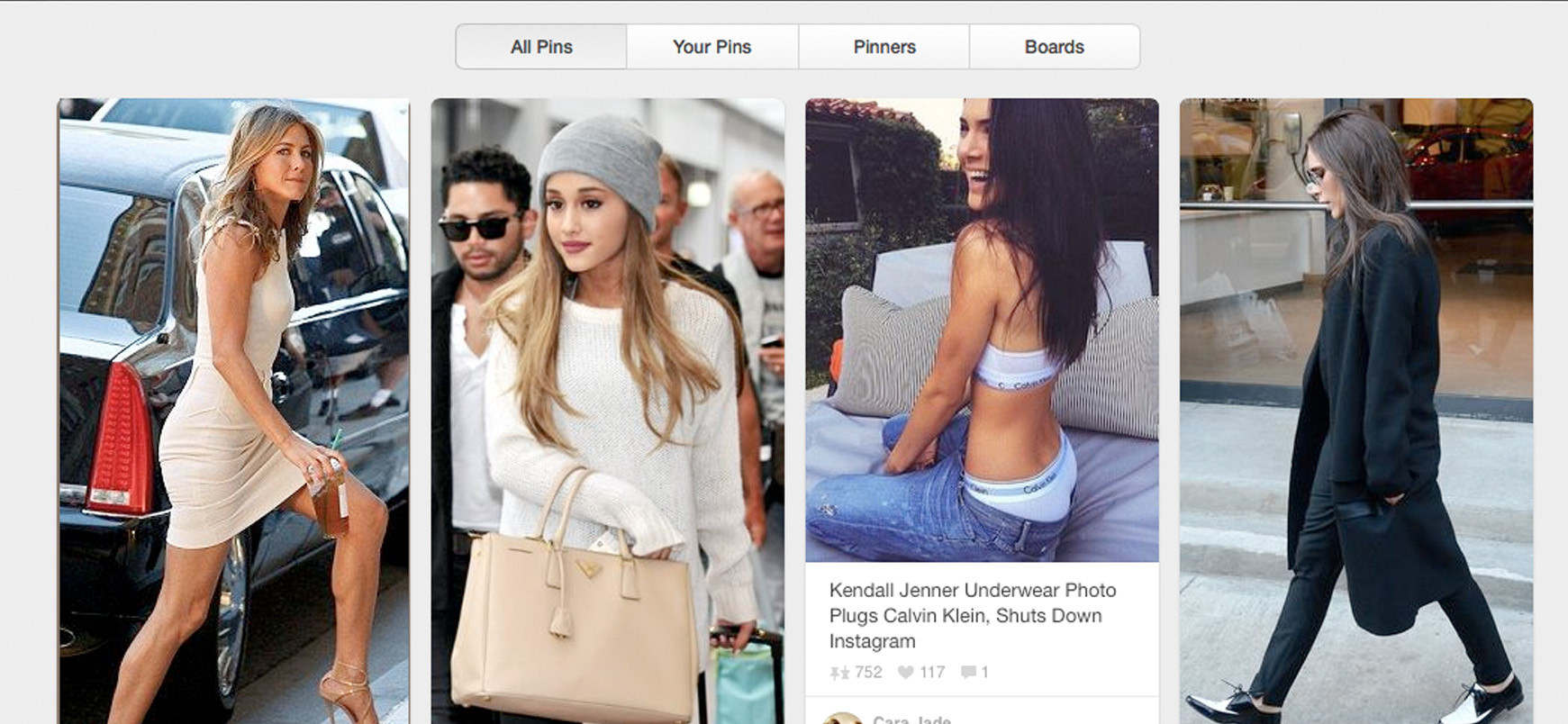
Card Based Design
Content needs to be able to fit onto different types and sizes of screen, and using a card based design is the easiest way to make it work across platforms. Cards are small contained pieces of information – just like a greeting card.
According to Cognition Agency “Card based designs are becoming increasingly popular, and can already be found on a wide range of websites such as Pinterest, Facebook and Twitter.” They are a highly functional and effective way of presenting information in a condensed format but they can also be expanded to reveal more information, flipped to provide more details and various multimedia content can be embedded in them.
It’s not just about the visual though – card design is also functional. It can prompt users to perform actions like sharing, liking, pinning or purchasing a product – perfect for social media.
Here is an example of card based design on Pinterest
