5 Top Trends for 2014
1: Long scrolling sites
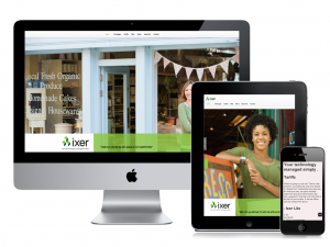
We’ve become comfortable with scrolling through a website to read and find information, and now with websites using more design techniques such as increased white space and responsive Web design, long scrolling sites are starting to appear again.
Check out our portfolio to see examples of long scrolling website design.
2: Heavier focus on mobile
Now that responsive Web design is becoming more common place, we are starting to see websites dig deeper into our mobile lifestyles. Designers are increasingly working on keeping their sites functioning on mobile devices, but developers are taking it a step further to help along with the fact that so many more devices are accessing the Web, and so many more users are using their phones to browse the Web.
Wondering what some things are being done? Integration with social media, asking for email subscriptions, long scrolling sites, and fast loading sites all help make the mobile Web a more friendlier place.
Check out our portfolio to see examples of responsive website design.
3: Large illustrated areas
Illustrated Intro Area Web Design (VIDEO)
If you asked us what is the number 1 trend in Web design today, this would be it.
Large illustrated areas (the “intro” area, often an image with a little amount of text, at the top of a website) on website home pages are running rampant and it is a trend we don’t see going away either in 2014. They are quickly taking over where sliders used to reside.
Either it be a simple blurred photo in the background with a heading centered in the middle, or a more elaborate one such as the illustrated area displayed on our very own Jabu Designs website, illustrated areas are quickly replacing sliders as the new attention-grabbers, and they are becoming increasingly creative and elaborate.
4: Videos in place of text
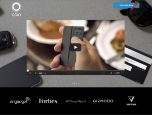
Why read about it when you can watch it? Something else you will start seeing all over the Web (especially in intro areas) are videos.
Videos are becoming easier to produce, and easier to share not on your website, but on social media as well. While some may argue that videos don’t belong on a website home page due to the large amount of data they take to load and run (especially on mobile devices and internet with data caps), videos are an effective way to communicate something technical or new when words just don’t cut it.
5: Flat design
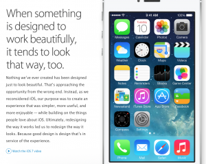
With the release of iOS7 came the design aesthetic most commonly known as “flat design.” While dropping drop shadows and gradients often seems like a good idea in some cases to give a more updated look to things, Apple took it to a whole other level by dropping pretty much any design element it could.
Apple has for a long time been a trendsetter, and what Apple does, the rest of the world seems to follow. iOS7 has been out for a while and already there are a flood of sites coming online every day with new “flat” designs. We don’t anticipate this trend ending in 2014.


